PICK UP

NEWS
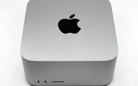
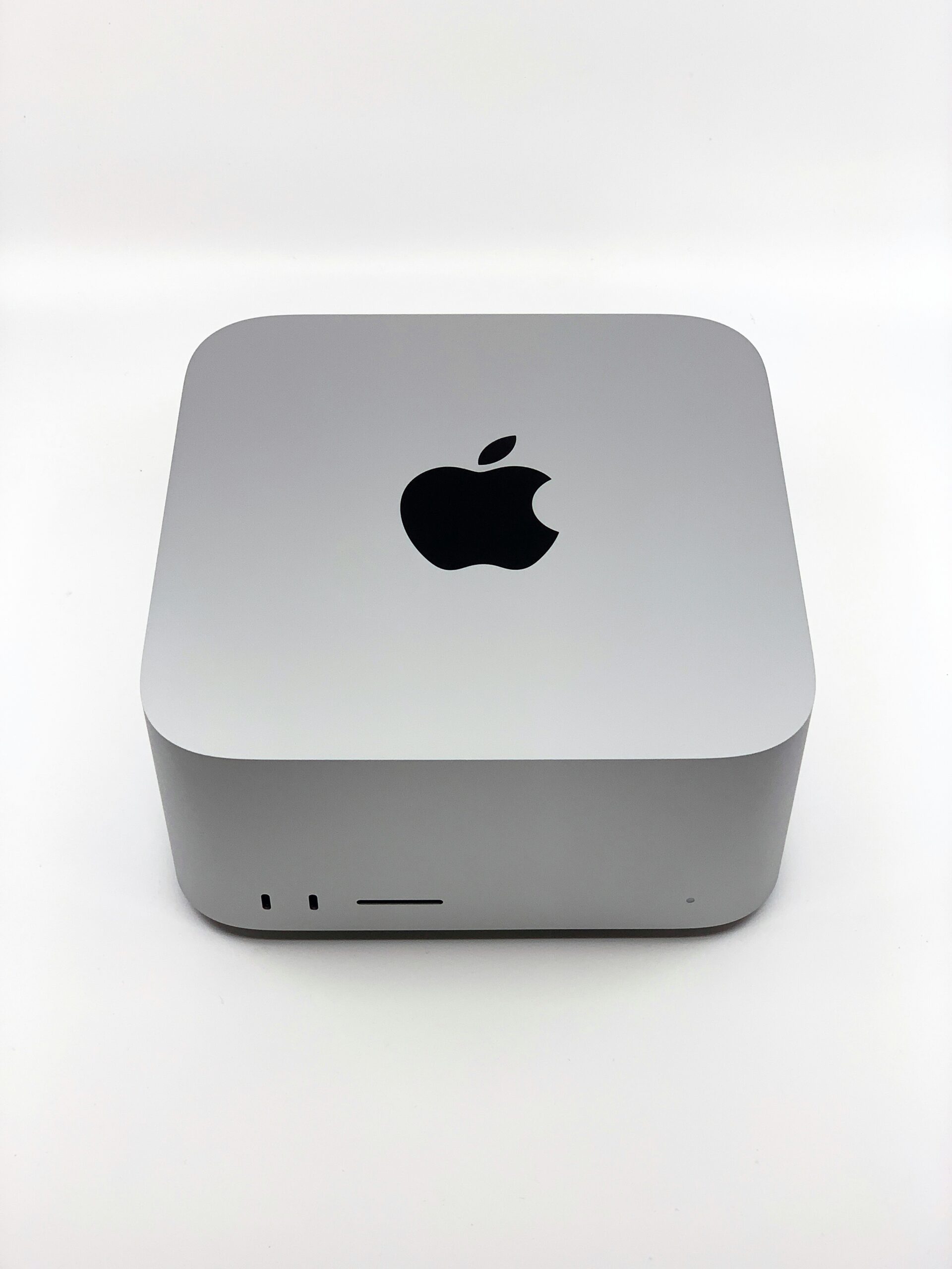
Apple公式から2026年5月初旬に削除されたM4 Mac miniの32GBメモリ構成(1TB SSD・214,800円)が、ビックカメラに在庫あり・販売中。世界的なメモリ不足を背景に、廃盤前の流通在庫と見られます。Apple公式では選べなくなった構成のため、検討中の人は早めにチェックを。
2026.05.24
NEWS
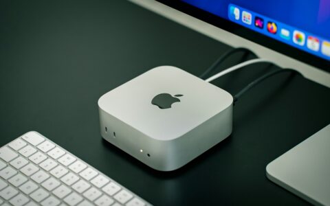
ヤマダウェブコムでM4 Mac miniの1TB SSDカスタマイズ構成(154,799円・送料無料)が在庫あり、最短5月26日(火)お届け。Apple公式は配送3〜4週間待ちのままなので、店舗受け取りに行けない人や1TBが欲しい人には有力な選択肢です。
2026.05.24
スマートデバイス
米国に続き日本でもM4 Mac miniの256GB最小構成が販売終了、新スタート構成は512GB・124,800円で実質3万円の値上げ。長らく品薄だったこの新最小構成がApple新宿店で翌日店舗受け取り可能に。スペック・価格・在庫確認のポイントをまとめます。
2026.05.24
NEWS
重度の精神疾患を抱える米国の退役軍人を対象に、ウェアラブルデバイスの受容性を調べた海外質的研究を紹介。睡眠・心拍・ストレス計測が日常生活に違和感なく取り入れられ、自身の体調変化への気づきや健康行動の動機付けにつながった一方、データ理解や長時間装着の課題も浮き彫りになりました。
2026.05.24
NEWS
Xiaomiの未発表スマートバンド「M2561B1」が台湾NCCとシンガポールIMDAの認証データベースに登場。標準モデルの「Smart Band 11」とは別系統で、廉価版にあたる「Xiaomi Smart Band 11 Active」ではないかと噂されています。日本での発売は現時点で未定です。
2026.05.24

NEWS
米ペンシルバニア州立大の研究チームが、髪の上から脳波を3日以上安定して計測できる新型ヒドロゲル電極をScience Advancesに発表。温度で液体と固体を行き来する熱可逆性と高い導電性を両立し、AR/VR向けの触覚(ハプティクス)研究や長時間ヘルスモニタリングの基盤になる成果として注目されています。
2026.05.24
スマートデバイス
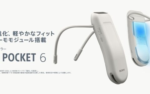
ソニーサーモテクノロジーが2026年5月12日にREON POCKET 6を発売。新開発の小型DUALサーモモジュールで冷温部温度を従来比最大-2℃に低減し、通勤に最適化した軽量パワフルなウェアラブルサーモデバイス新スタンダードを徹底紹介。
2026.05.24
スマートデバイス
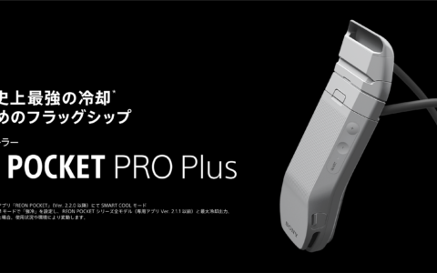
ソニーサーモテクノロジーが2026年4月21日に発売したウェアラブルサーモデバイス『REON POCKET PRO Plus』。シリーズ史上最強の冷却性能を実現し、新ネックバンドや調節式エアフローも採用したフラッグシップモデルを、価格や同時発売の『REON POCKET TAG 2』とあわせて紹介します。
2026.05.24
コラム・業界分析
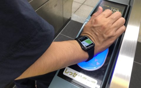
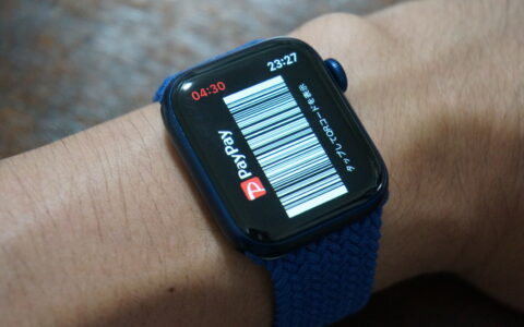
Apple直営の「Apple Store」全11店舗で「PayPay」が利用可能になりました。Apple Watchのバンドや充電器など普段使いの買い物が、スマホ一台でサッと会計できるように。利用方法と注意点をまとめます。
2026.05.24
NEWS
2026年5月23日時点で、楽天市場の「スマートウォッチ本体」ジャンルで売れている商品TOP30をランキング形式でまとめました。 GARMIN・Apple Watch・HUAWEI・Xiaomi・SUUNTO
2026.05.23
SALE
Amazon.co.jpで20%以上オフ販売中のスマートウォッチ4モデルを割引額順に紹介。Galaxy Watch Ultra 2025は最大26%OFFで約33,000円引き、Garmin vivoactive 5は32%OFFと旗艦モデルが大幅値下げ中です。
2026.05.23
NEWS
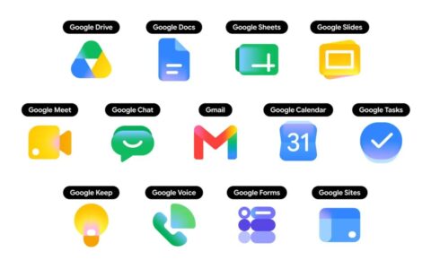
GoogleがGmail・ドライブ・ドキュメントなどWorkspaceアプリの新アイコンを公開。立体感のあるグラデーションデザインへ刷新し、4色縛りから脱却。Webアプリランチャーで先行展開後、iOSとAndroidアプリにも順次反映されています。
2026.05.22
FEATURE
2026.01.17
FEATURE

2025.11.18
FEATURE

2025.11.15
NEWS
2025.05.01
FEATURE
2025.04.18
NEWS
2021.08.28


「Google Health」アプリを触った印象を速報レポート——AI健康コーチ×データ集約のファーストインプレッション
先行入手「Google Fitbit Air」外観レビュー:11gで”装着を忘れる”、その第一印象
【在庫あり】M4 Mac miniの1TB SSD構成(154,799円)がヤマダウェブコムで最短5/26お届け
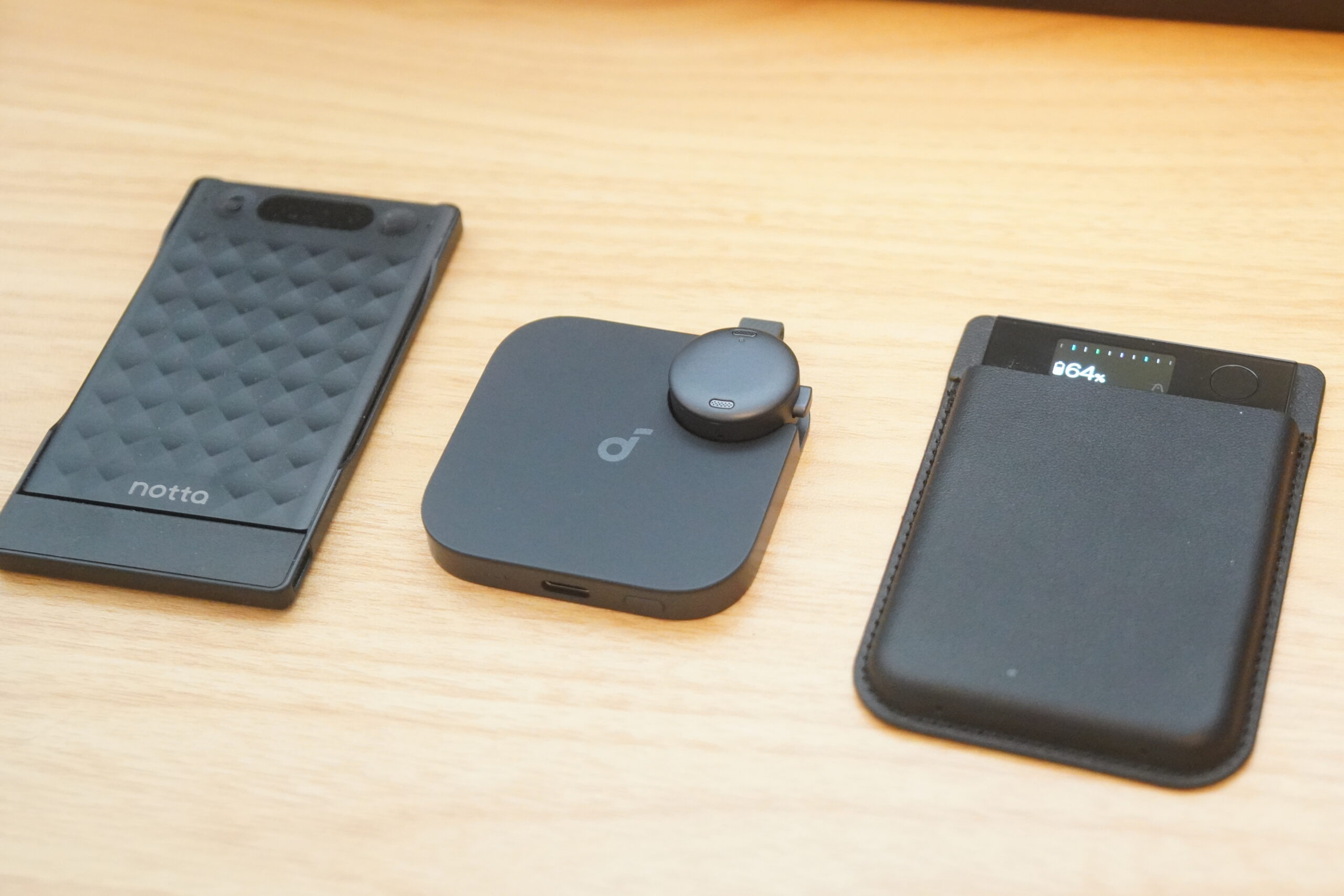
【3機種比較】AIボイスレコーダーの文字起こし精度を実取材で検証|Soundcore Work・Plaud Note Pro・Notta Memo
【セール速報】Amazonで20%以上オフのスマートウォッチ4モデルまとめ|Galaxy Watch Ultra・HUAWEI GT 6 Pro・Garmin vivoactive 5など最大32%OFF【2026年5月22日時点】

Google One「AI Pro」プランに使用量上限とAIクレジット制度が導入。2026年5月20日から適用開始
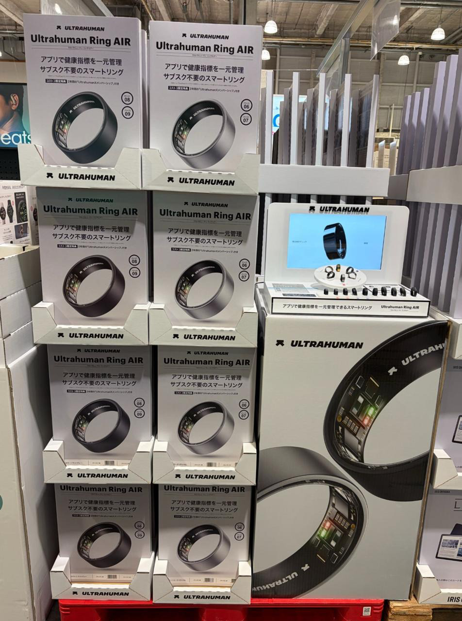
Ultrahuman Ring AIRがコストコに登場!全国9店舗&オンラインストアで販売中
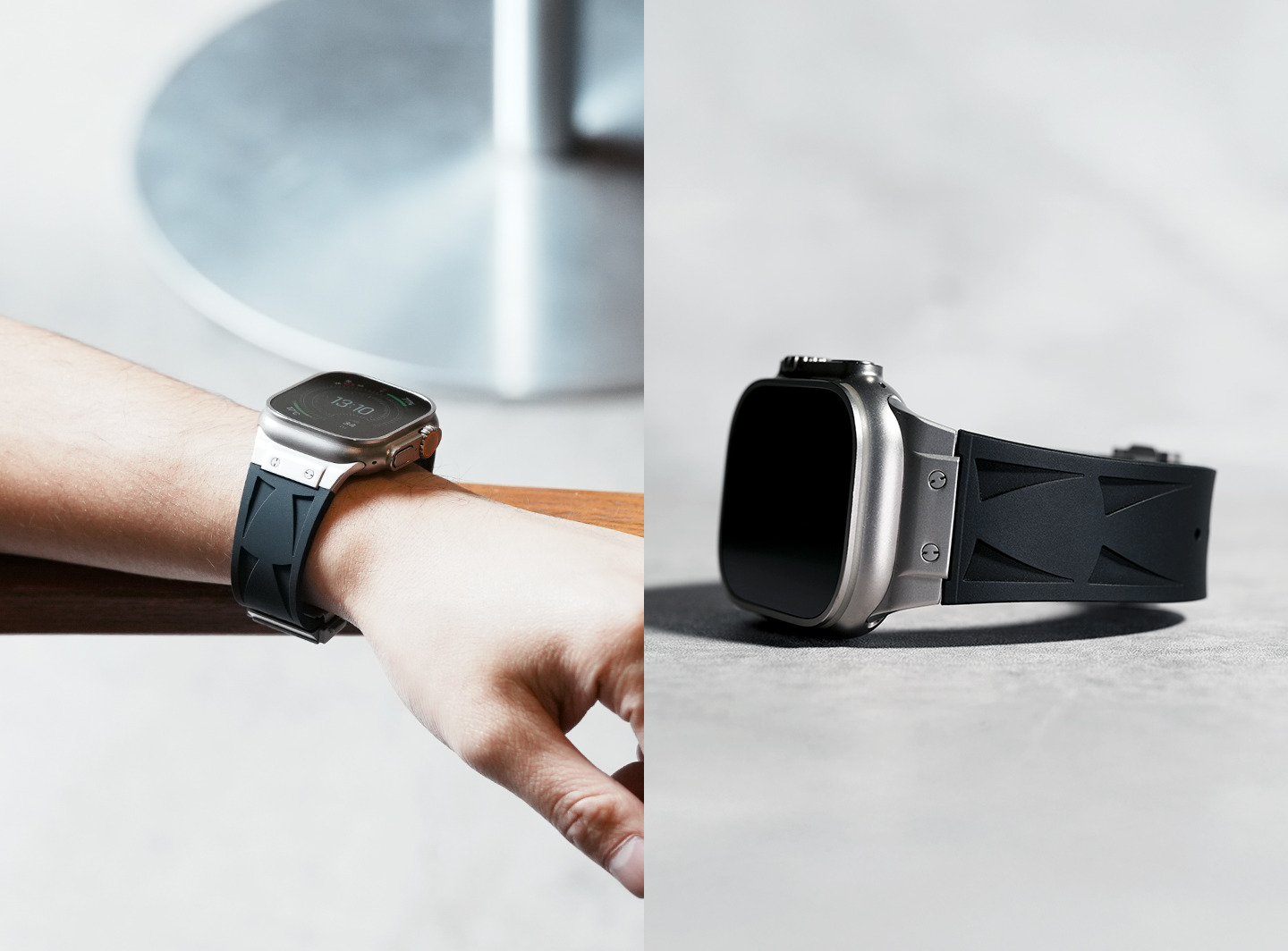
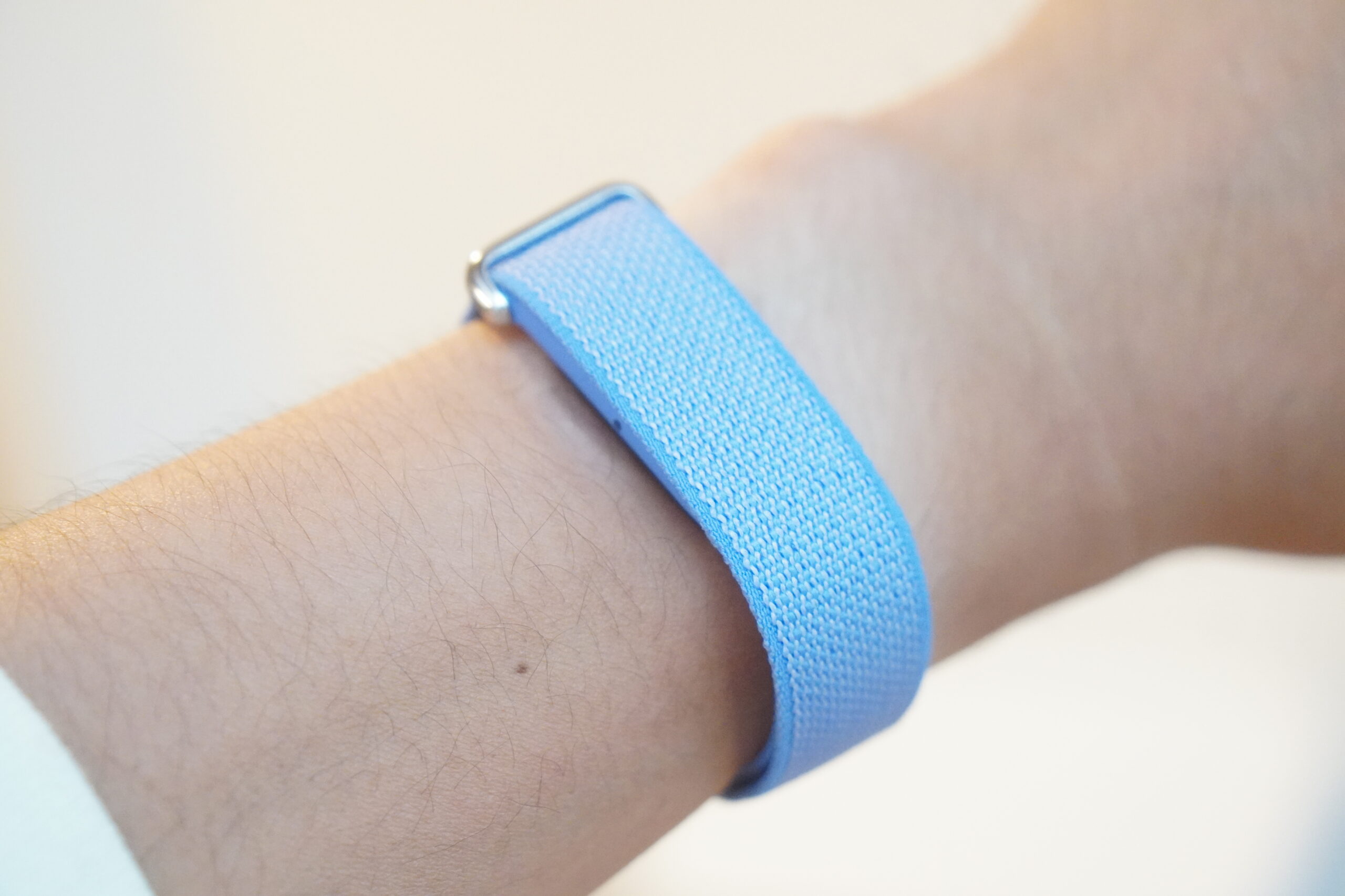
“手元で差をつける”Apple Watchバンド「Bandee Joy」、卸仕入れプラットフォーム「goooods」に出店開始
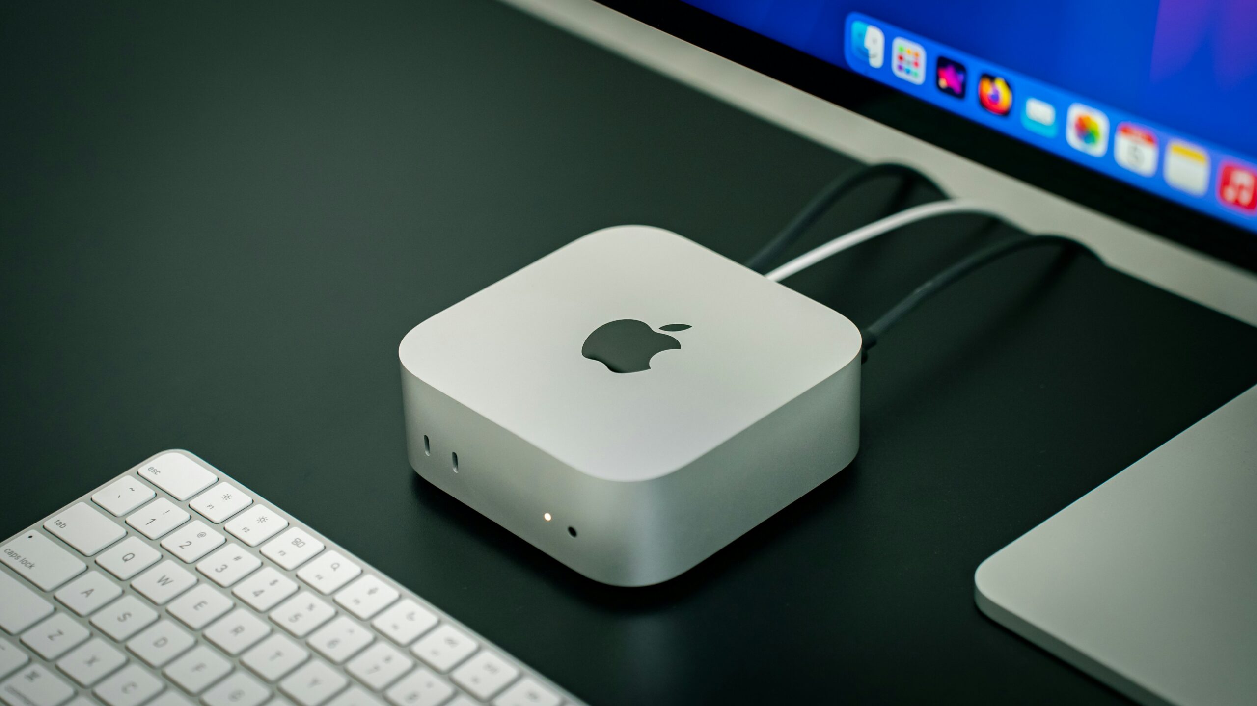
M4チップ搭載 Mac mini最小構成の店舗在庫が復活!Apple新宿なら明日受け取りOK
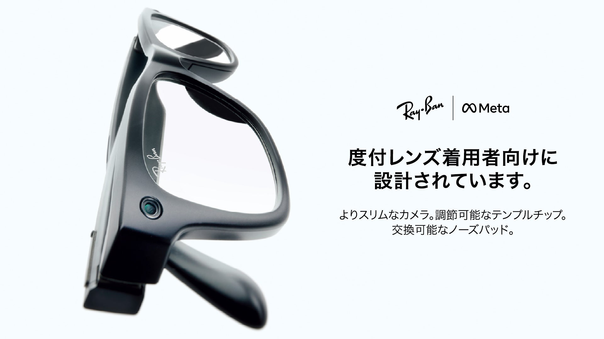
メガネスーパー、AIグラス「Ray-Ban Meta」を限定5店舗で取扱い開始。度付き対応・レンズ相談までサポート

【在庫あり】Apple公式廃盤のM4 Mac mini 32GBメモリ/1TB構成(214,800円)がビックカメラで販売中
【在庫あり】M4 Mac miniの1TB SSD構成(154,799円)がヤマダウェブコムで最短5/26お届け
M4チップ搭載 Mac mini最小構成の店舗在庫が復活!Apple新宿なら明日受け取りOK
ウェアラブルは精神疾患ケアの「すき間時間」を埋められるか|米VAの研究で見えた可能性と長期利用の壁
【海外発表】Xiaomiの未発表スマートバンド「M2561B1」が台湾NCC・シンガポールIMDAに登場。Mi Band 11 Activeか【日本発売は未定】
次世代ウェアラブルが“脳”に届く日──髪の上から脳波を3日以上計測できる新ゲル電極、米ペンステート大が発表
ソニー『REON POCKET 6』発売|小型DUALサーモモジュールで冷温部温度を従来比最大-2℃に
ソニーの“着るクーラー”最新作『REON POCKET PRO Plus』はこの夏注目のウェアラブル冷却デバイス|シリーズ史上最強冷却を実現
Apple Store全店でPayPay決済がスタート|直営11店舗で残高払い・クレジット払いに対応
【2026年5月】楽天で売れているスマートウォッチランキング TOP30|5/23時点